
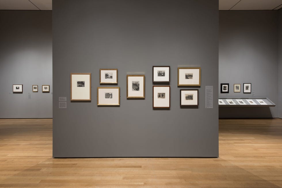
Installation view of Edgar Degas: A Strange New Beauty at The Museum of Modern Art, New York Martin Seck
According to elledecor.com:
An art gallery wall should draw attention to your [original artwork] with a color that makes them stand out. But it should also reflect the overall atmosphere of your collection. “The color that you select should make the artwork really pop,” Charlie Cosby, head of creative at Farrow & Ball, told Fast Co.Design. “By using the right colors behind the artworks, you can make the viewer walk into a room and experience a painting in a more atmospheric way.”
Take, for example, the exhibition Edgar Degas: A Strange New Beauty currently on display at the Museum of Modern Art (MoMA) in New York City. Farrow & Ball colorists and MoMA curators toiled away for months to create a perfect shade that could pull out the inky blacks and charcoal grays in Degas’ works. eflect the overall atmosphere of your collection. “The color that you select should make the artwork really pop,” Charlie Cosby, head of creative at Farrow & Ball, told Fast Co.Design. “By using the right colors behind the artworks, you can make the viewer walk into a room and experience a painting in a more atmospheric way.”
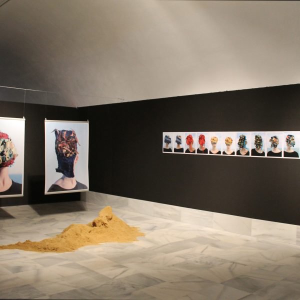
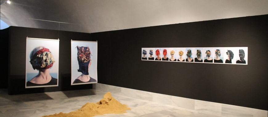
Are you showcasing bold graphic pieces, or soft paintings? In the case of the Degas exhibit, the stormy gray reflected the softness of the works. However, if your artwork is more graphic and features bold lines, a backdrop that provides contrast is preferable, says Cosby.
4 Tips to help you choose the right wall color:
- Opt For Flat Paint – “Flat paint is typically a better choice to highlight art,” Jim Eaucette, Sherwin-Williams district manager in Norfolk, Va. “There’s no sheen, so the light reflection will come from the art, not the wall.”
- Plain White Sometimes Works (But Not Always) – “All-white rooms are a 20th-century concept,” interior painter Mark Chamberlain told ARTNews. Contemporary art galleries are embracing less harsh hues: In one installation of Pacific Art at the Los Angeles County Museum of Art, the exhibition designer painted the walls with a maté tea wash. “It almost looks like a cup of green tea,” Nancy Thomas, the museum’s senior deputy director, told ARTNews. “It provides a little more of a softer, more natural environment for these works.”
- Create An Accent Wall – To highlight a particular painting and create an accent wall, Sherwin-Williams suggests choosing a color from the painting for the wall and painting the other walls a different color. Keep in mind: Dark walls make a painting appear lighter.
- Don’t Go Overboard – A color may not seem very strong until your entire room is covered in it. “You want the walls to be support actors,” Jeffrey Strean, director of design and architecture at Cleveland Museum of Art, told Cleveland.com. Homeowners often underestimate the strength of a color. Pay attention to undertones—all the color you need might be hidden in a gray or beige, Strean said.
Comments (0)